LOGO RE-DESIGN
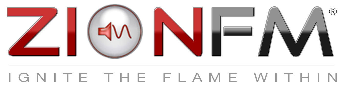
Below is the original logo used for the last 5 years. My client didnt want to change the logo too much so as to confuse the customer. They wanted it to be modernized for the upcoming "Flat" website design that was being revamped. The idea was to upgrade the logo to reflect modern design trends while still maintaining the relatability of the brand in the consumers mind. They also needed a logo that could be rendered on many media formats in print, online and on merch.
Although this brand is a digital media (online radio) group, I decided the speaker in the circle didn't quite express their specific mission and beliefs. WIth their famous slogan being "Ignight The Flame Within", I felt it was more appropriate to adapt the logo icon to that theme. Hence the alteration from speaker to flame in the "O".
ORIGINAL LOGO:
NEW "FLAT" LOGO DESIGN

LOGO ICON FOR MARKETING